Branding
Packaging Design
Fashion & Lifestyle
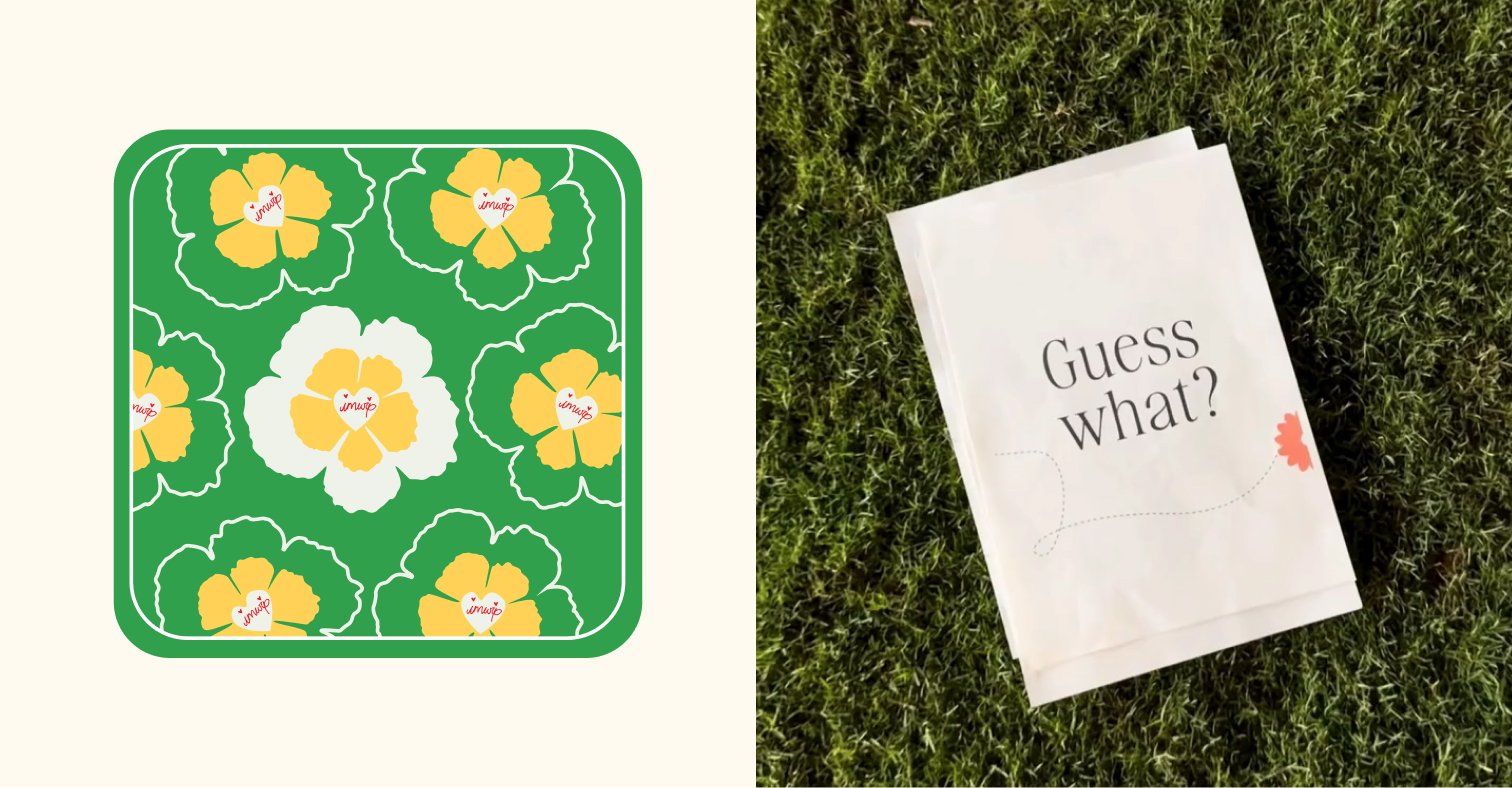
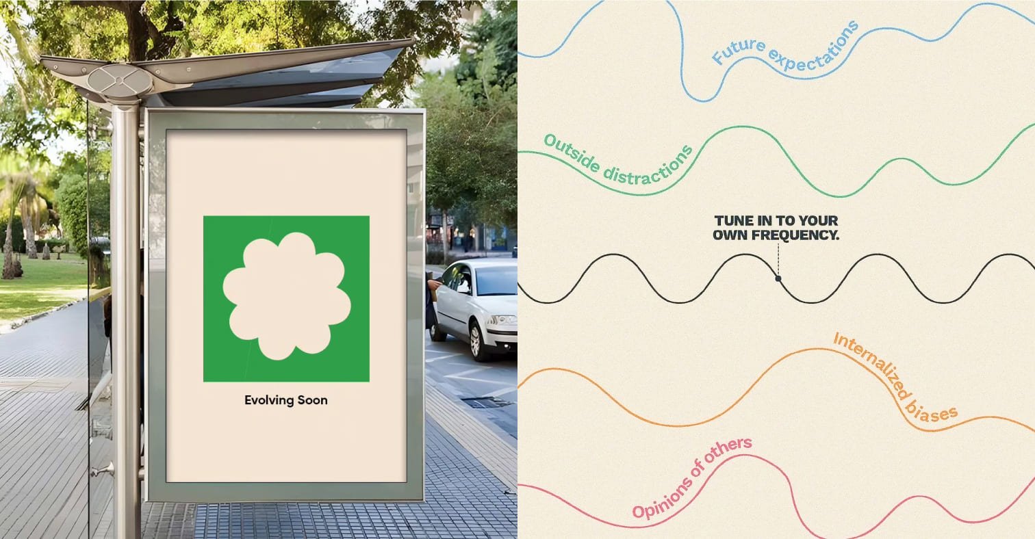
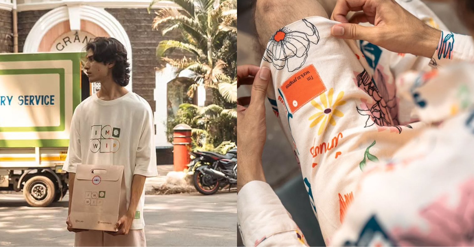
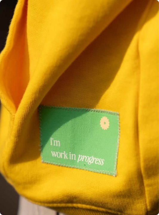
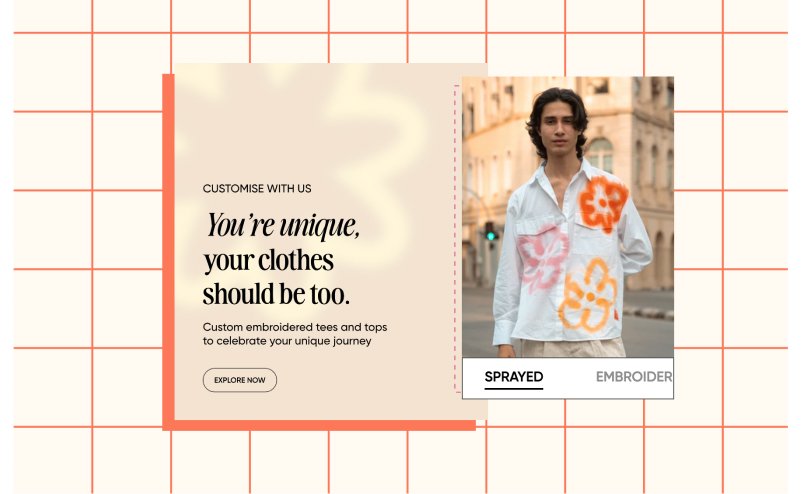
IMWIP—short for I’m Work In Progress—is more than just a clothing brand. It’s a movement that celebrates self-expression, healing, and individuality. Built for a community of reflective, curious, and ever-evolving souls, IMWIP uses fashion as a tool for storytelling and self-discovery. Flight Mode partnered with IMWIP to design a brand identity that feels uplifting, playful, and deeply personal, aligning with their message: It’s okay to be a work in progress.
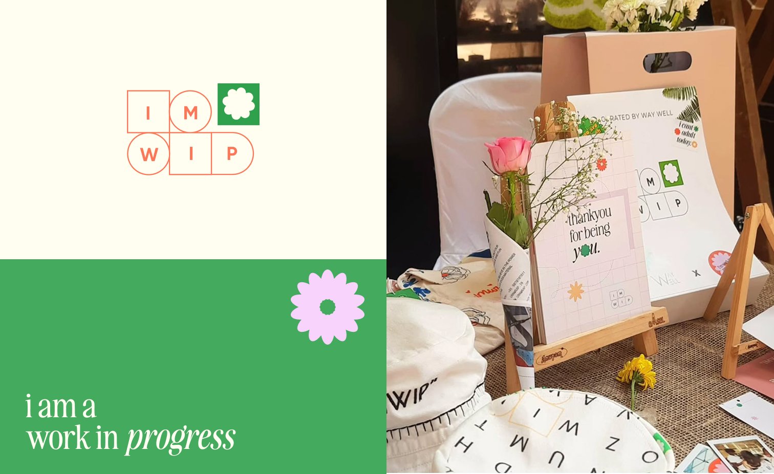
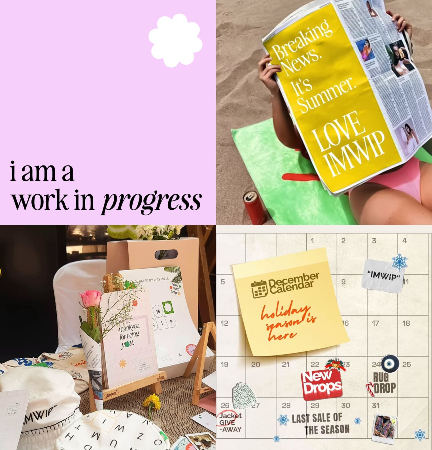
The brand needed to visually express its emotional depth and community spirit while still appealing to a design-forward, fashion-conscious audience. We had to strike a balance between playfulness and meaning—creating something that felt both aesthetic and authentic. The challenge was to build a system that looked good on garments and packaging, while also reinforcing the brand’s message of progress, acceptance, and connection.
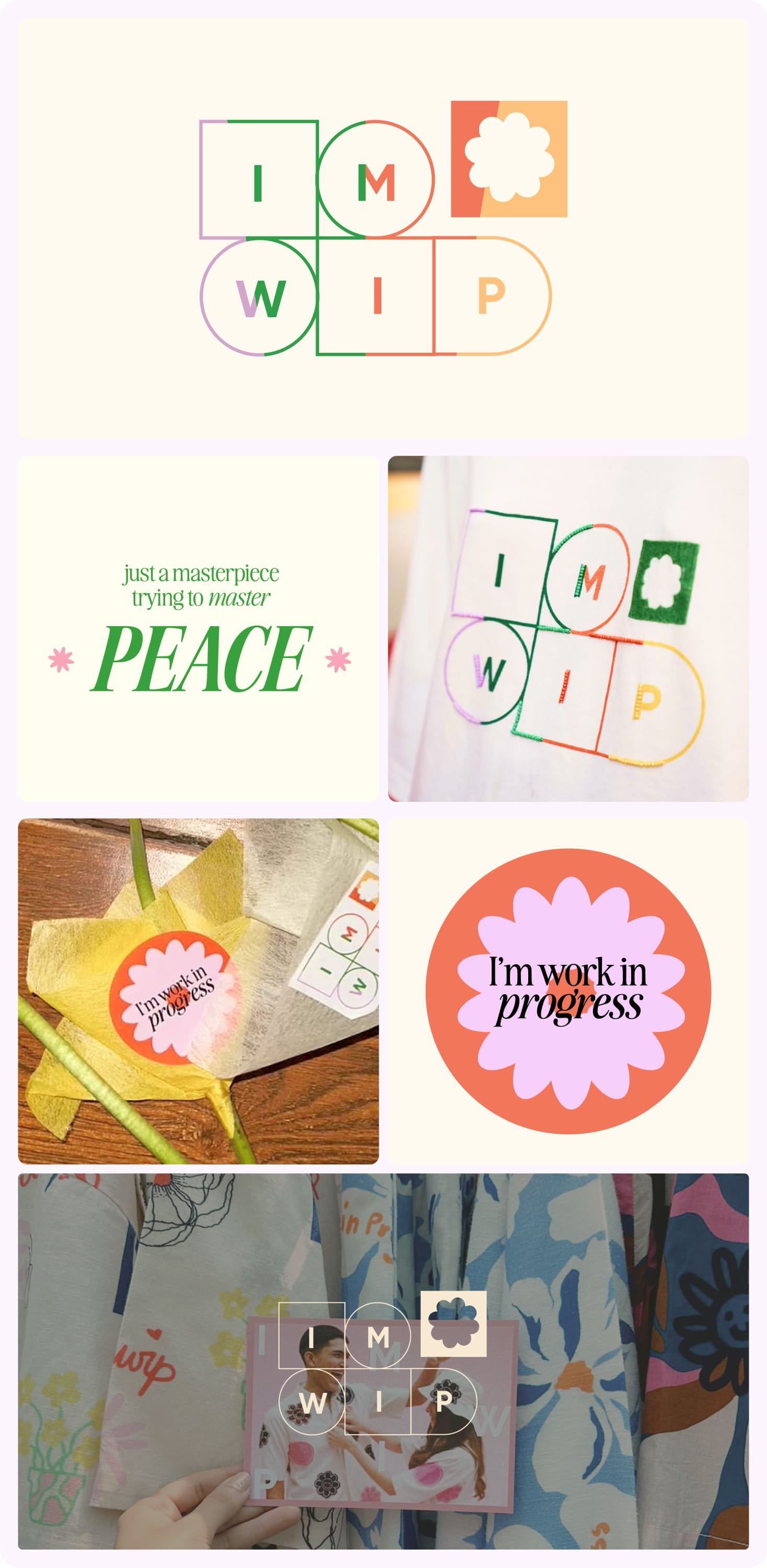
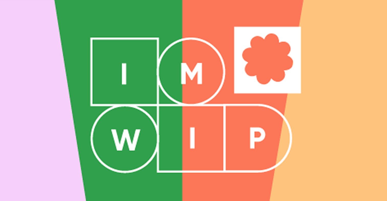
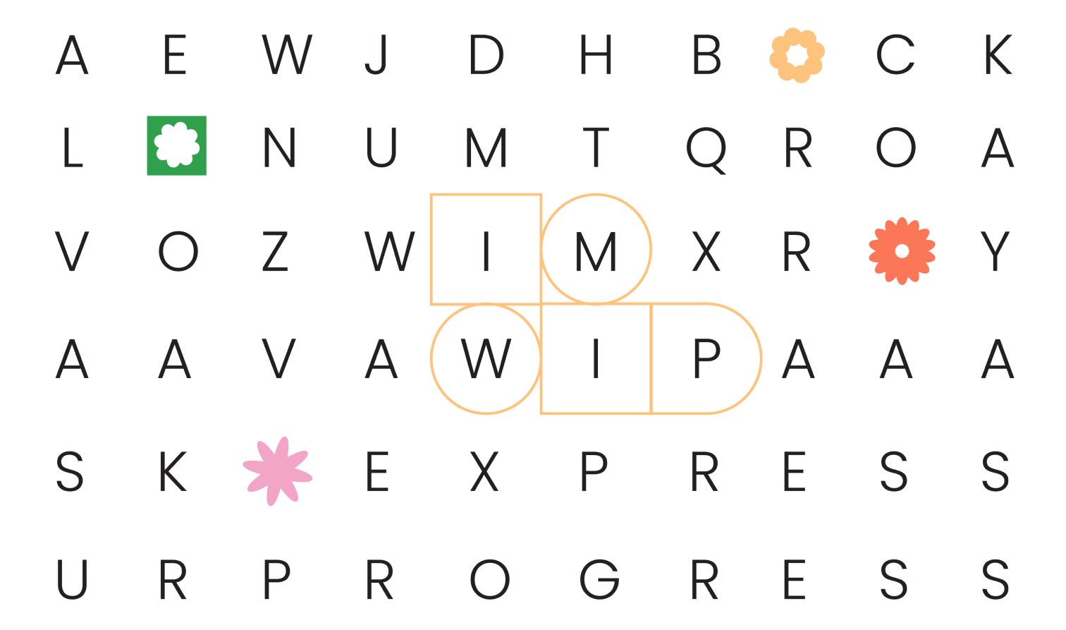
"Flight Mode brought our message to life. The crossword-style logo, the pastel hues, the way every visual detail speaks to who we are... it’s magic. Our community feels seen and connected, and every piece of packaging tells a story. The team truly understood our heart and turned it into design."
Ishita Mehta
Founder, IMWIP

IMWIP’S NEW VISUAL LANGUAGE INCREASED SOCIAL SHARING BY 45% AND BOOSTED ORGANIC BRAND MENTIONS ACROSS PLATFORMS.
WITH A DEEPLY PERSONAL AND STORY-DRIVEN DESIGN SYSTEM, CUSTOMER RETENTION ROSE BY 30%, FUELED BY COMMUNITY LOYALTY AND BRAND AFFINITY.
SINCE LAUNCHING THE NEW IDENTITY, IMWIP HAS SEEN A 50% UPTICK IN BRAND MENTIONS AND USER-GENERATED CONTENT. THE COMMUNITY-FIRST VISUAL LANGUAGE HAS HELPED IMWIP STAND OUT IN THE FASHION SPACE—FOSTERING DEEPER CONNECTIONS WITH AUDIENCES WHO VALUE SELF-EXPRESSION AND AUTHENTICITY.

/6
Work ![]()
