
CONTENT
Crafting Your Brand Identity: The Foundation of Your Story
A brand isn’t just what you say about yourself—it’s what people say about you when you’re not in the room. It’s the gut feeling your audience gets when they see your name, hear your story, or experience your product.
It’s the reason they trust you, remember you, and (hopefully) rave about you to their friends.
Think of it this way: your logo is just the starting point.
Your visual identity builds on that with a structured design system.
But true brand identity goes deeper—it’s the complete experience your audience has with your brand. It’s how they feel when they see your content, use your product, or engage with your services.
Building a strong brand identity is like laying the foundation for a great story. It sets the stage for everything else—your messaging, design, and customer interactions. Done right, it creates recognition, trust, and emotional connection.
In this post, we’ll break down the key elements of a powerful brand identity, clarify how it fits into the broader world of branding, and highlight why consistency is everything. Plus, we’ll share tips on evolving your brand over time without losing what makes it unique.
Let’s dive in.
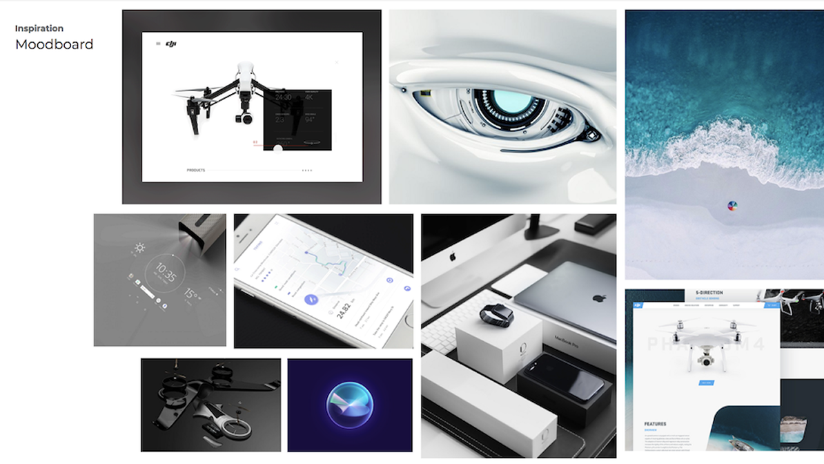
Setting the Stage: Understanding Moodboarding in Branding
Before a brand can tell its story, it needs to see it. That’s where moodboarding comes in —the fun, visual kickoff to building your brand identity.
A mood board is like a vision board for your business. It’s a curated collection of images, colors, fonts, and design snippets that capture the vibe and energy you want your brand to radiate. Think of it as a visual cheat sheet that
helps everyone—from designers to clients—understand your brand’s personality at a glance.
Want to explore moodboards in action?
Why Moodboards Matter
A well-crafted mood board isn’t just about making things look pretty—it’s about making them feel right. It helps you:
- Define your brand’s personality before diving into design.
- Stay visually consistent across platforms.
- Communicate your brand’s vibe to designers (without resorting to wild hand gestures).
“Designing without visual references is like describing a sunset in the dark—impossible to grasp, difficult to articulate, and nearly impossible to connect with. A mood board solves this by giving founders a tangible reference point,
setting the tone, and aligning the vision from the start of the project.”
What Goes Into a Mood Board?
Here’s what you’ll typically find:
- Color Palette – Sets the mood (yes, colors have psychology!).
- Typography – Fonts that match your brand’s personality.
- Imagery – Photos and graphics that represent your aesthetic.
Want to know how to select the right visuals for your brand?
- Textures & Patterns – Add depth and style.
- Inspiration & Keywords – Words and visuals that define your brand’s essence.
How to Create a Killer Mood Board
- Find Your Vibe – Jot down 3–5 words that sum up your brand’s personality.
- Gather Inspiration – Pinterest, Instagram, magazine clippings—whatever sparks ideas.
- Curate, Don’t Collect –Stick to visuals that fit your brand. No distractions!
- Assemble & Refine – Use digital tools or go old-school with a physical board.
The Bigger Picture
Moodboarding isn’t just about pretty pictures—it’s the foundation of your brand’s visual journey. By creating a clear visual guide early on, you set the stage for a cohesive brand identity that shines through in everything you do. Plus,
it’s a lot more fun than diving straight into design work without a plan!
The Building Blocks: Unpacking the Components of a Brand Identity
A brand identity isn’t just a logo or a color palette—it’s the entire personality of a brand, shaping how it’s seen, recognized, and remembered. Think of it as the DNA of your brand, with multiple components working together to create a cohesive and
Logo Design: The Face of Your Brand
Your logo is the first thing people notice about your brand. It should be simple, memorable, and timeless. A great logo doesn’t just look good—it communicates something deeper about your brand’s personality and values.
What Makes a Logo Work?
Simplicity: Clean, uncluttered logos are easier to recognize and stand the test of time.
Memorability: A distinct visual element makes it easier for people to recall your brand at a glance.
Originality: No copy-pasting from competitors—your logo should be uniquely yours.
Versatility: It should look good on everything from a billboard to a business card, in color or black and white.
Scalability: Whether on a massive ad or a tiny social media icon, it must remain clear and readable.
Timelessness: Avoid fleeting trends. A classic design stays relevant for years.
“Designing without visual references is like trying to describe a sunset in the dark—it’s impossible to understand, hard to articulate, and even tougher to connect with—it has to have a reference point to better connect with the
founders on their vision.”
When designing a logo, start with the fundamentals: Who is your brand? What makes it different? What feelings should it evoke? Answering these questions helps create a logo that isn’t just aesthetically pleasing but strategically
aligned with your brand’s core identity.
ted collection of images, colors, fonts, and design snippets that capture the vibe and energy you want your brand to radiate. Think of it as a visual cheat sheet that helps everyone—from designers to clients—understand your brand’s personality at a glance.
The Design Process: From Concept to Final Logo
Research & Sketching – Before jumping onto digital tools, start with rough sketches to explore ideas freely.
Black & White First – A strong logo works without color, ensuring it’s effective in any context.
Typography & Color Selection – Fonts and colors should complement your brand’s personality.
Testing & Refining – Make sure your logo remains effective across different platforms and sizes.
At its core, an effective logo is simple, original, versatile, and timeless. It’s more than just a graphic—it’s a visual shorthand for everything your brand represents.
Picking the Right Colors: More Than Just Aesthetics
The colors you choose shape how people perceive your brand, create a strong first impression, and build trust with your audience. Similarly, selecting the right visuals plays a vital role in building a strong identity.
A well-chosen palette:
- Creates a consistent and recognizable identity
- Differentiates you from competitors
- Evokes emotions that align with your brand
- Enhances the overall user experience
How to Choose the Right Colors
A brand’s palette typically includes:
🎨 Primary Color – The core color representing your brand
🎨 Secondary Colors – Supporting colors that add depth
🎨 Accent Colors – Used sparingly for contrast and emphasis
Steps to Defining Your Brand Colors
- Identify Your Brand’s Personality – Bold and energetic? Calm and trustworthy? Your colors should reflect that.
- Understand Color Psychology – Red signals urgency and passion, while blue conveys trust and calmness.
- Analyze Competitors & Trends – See what’s common in your industry and decide if you want to follow or stand out.
- Test Different Combinations – Play around with color schemes to find the best fit.
- Apply the 60-30-10 Rule – A balanced approach where 60% is primary, 30% secondary, and 10% accent.
Some brands rely on a single dominant color, while others use a mix of three or more. Mood boards and color generators can help refine your choices.
Colors do more than make things look good—they set the tone, create emotion, and strengthen brand identity.
Typography: More than Just Fonts
Typography isn’t just about picking pretty fonts—it shapes how your brand is perceived, improves readability, and makes your message more impactful.
Keep it Simple and Consistent
The best typography guidelines follow one golden rule: less is more. Stick to two to three fonts—one for headings, one for subheadings, and one for body text.
A well-chosen font can instantly communicate your brand’s personality:
Playful brands lean toward quirky, handwritten fonts.
Luxury brands favor sleek, classic typefaces.
Tech-forward brands often go for modern sans-serifs.
Whatever you choose, readability comes first. Trendy fonts may look cool today but can age poorly. Make sure your text is legible on all platforms, including small screens.
The Art of Font Pairing
A great font combination creates contrast without clashing. A simple trick? Pair a serif font with a sans-serif font—this adds visual interest while keeping things balanced.
Want to add more personality? Use stylish fonts sparingly for accents in logos, headlines, or taglines while keeping body text clean and readable.
Practical Considerations
- Web-Friendly Fonts – Ensure compatibility across all browsers.
- Licensing – Make sure you have the right to use your fonts commercially.
- Hierarchy & Spacing – Play with size, weight, and kerning (letter spacing) to guide the reader’s eye.
- Client-Facing Documents – If you’re creating presentations or documents in Microsoft PowerPoint or Word, use widely available system fonts (like Arial, Calibri, or Times New Roman) to avoid formatting issues when shared.Typography isn’t just decoration—it’s an essential part of your brand’s voice. When done right, it makes your brand feel polished, professional, and easy to connect with.
Appropriate Imagery Usage
Brand imagery is a powerful tool that shapes how people perceive your brand. In a visually driven world, your choice of images influences engagement, trust, and recognition.
Key Principles of Brand imagery:
- Quality Over Quantity – Use high-resolution, professional images that align with your brand.
- Consistency is Key – Maintain a unified look across all visuals.
- Emotion & Storytelling – Choose images that evoke the right emotions and reinforce your brand narrative.
- Relevance Matters – Ensure every image supports your brand’s values, mission, and audience perception.
Types of Brand Imagery
Photography – The backbone of brand visuals, whether product shots, lifestyle images, or corporate headshots.
Illustrations – Custom graphics can add uniqueness and personality.
Infographics – Ideal for simplifying complex information.
Videos – Engaging and versatile, great for storytelling. Icons & Patterns – Subtle yet effective in maintaining a cohesive brand identity.
Developing Imagery Guidelines
Define Your Brand’s Mood & Tone – Is your brand modern, playful, serious, or luxurious? Your imagery should reflect that.
Color & Composition – Ensure visual consistency through color schemes, lighting, and framing.
Human Subjects & Style – Clothing, expressions, and settings should align with your brand’s identity. Stock vs.
Custom Imagery – When using stock photos, choose ones that feel authentic and avoid generic visuals.
Overlaying Text – Maintain readability with clear contrast and defined placement.
Example: McDonald’s & Brand Imagery
McDonald’s consistently uses red and yellow in its branding, reinforcing excitement and hunger. Their imagery features warm lighting, smiling people, and product close-ups, all reinforcing a welcoming and fast-paced environment.
In a nutshell, think of your brand imagery as a friendly handshake with your audience—it should be clear, consistent, and a true reflection of who you are. With the right visuals, you’re not just showing your products or services, you’re sharing your story in a way that’s both engaging and memorable.
Brand Voice Development
Your brand voice is the personality and tone of your brand’s communication. It should be consistent across all platforms—from social media and ads to customer emails and website content. Finding the right tone—whether bold, serious, or playful—can dramatically influence how your audience connects with you. Discover how to define and refine your brand voice effectively to make it resonate.
Brand Voice vs. Brand Tone:
Brand Voice – The unchanging personality of your brand.
Brand Tone – How that voice adapts depending on the context (e.g., a social media post vs. a legal document).
How to Define Your Brand Voice:
🔹 Start with Your Core Values – Your mission and values should shape your communication.
🔹 Know Your Audience – Create detailed buyer personas and tailor your messaging accordingly.
🔹 Identify Key Traits – Pick 3-5 adjectives that describe your brand’s personality (e.g., bold, friendly, sophisticated).
🔹 Conduct an Audit – Analyze your current content to identify inconsistencies or areas for improvement.
Creating a Brand Voice Guide:
📖“Sounds Like” vs. “Doesn’t Sound Like” – A simple chart defining what fits your voice and what doesn’t.
📖 Grammar & Mechanics – Decide on your stance on contractions, punctuation, and sentence structure.
📖 Tone Variations – Define how your tone shifts in different contexts (e.g., playful on social, formal in reports).
📖 Examples & Do’s/Don’ts – Provide sample messages to guide your team’s writing style.
Example: Mailchimp’s Brand Voice
Mailchimp maintains a friendly, informal, and slightly humorous voice across all platforms, making its tech-driven content feel approachable.
Practical Considerations
✅ Monitor & Adapt – Regularly review how your brand voice resonates with your audience and refine as needed.
A strong, well-defined brand voice builds trust, enhances recognition, and ensures every interaction with your brand feels intentional and cohesive. Not sure which tone of voice suits your brand? Explore how to find your brand voice and create messaging that feels authentic and consistent.
When Should You Refresh Your Brand Identity?
Over time, even the strongest brands can lose their relevance. Markets evolve, customer expectations shift, and businesses grow in new directions. Your brand identity should reflect these changes.
Wondering if your brand is still working for you? Here’s a quick read on Signs It’s Time to Rebrand Your Business to help you evaluate if it’s time for a refresh.
Brand Identity vs. Branding: the difference
While often used interchangeably, brand identity and branding serve different roles:
| Term | Meaning |
| Brand | How people perceive your company. |
| Branding | The strategy used to shape that perception. |
| Brand Identity | The tangible elements (logo, colors, typography, voice) that visually and verbally express your brand. |
Brand Identity = How You Look & Sound
It includes your logo, colors, typography, imagery, and brand voice—the personality your business presents to the world.
Branding = How You Build Perception
It’s the ongoing strategy behind your marketing, positioning, and customer experience to influence how people see your brand.
How They Work Together
Think of brand identity as your appearance and branding as your actions—both shape how people perceive you.
Want to explore this Brand Identity Vs Branding in depth?
The Power of Consistency: Building Trust & Recognition
Brand consistency is the foundation of trust, recognition, and loyalty. It ensures that your visuals, messaging, and tone remain uniform across all channels, making your brand instantly recognizable and reliable.
Why Brand Consistency Matters
| Benefit | Impact |
| Brand Recognition | Makes your business memorable and easy to identify. |
| Trust & Credibility | Conveys professionalism and reliability. |
| Customer Loyalty | Fosters familiarity, strengthening emotional connections. |
| Increased Revenue | Drives repeat purchases and long-term customer retention. |
| Reliability & Professionalism | Signals attention to detail and commitment to quality. |
| Memorability | Helps your brand stand out in a crowded market. |
| Stronger Relationships | Builds deeper connections with your audience. |
| Internal Alignment | Ensures employees represent the brand consistently. |
The Risk of Inconsistency
Inconsistent branding confuses customers, weakens trust, and dilutes brand impact—leading to lost opportunities and disengagement. Maintaining uniformity across every customer touchpoint is essential for reinforcing trust and recognition. Learn how consistency plays a key role in shaping perceptions.
By maintaining a cohesive brand identity, you create a lasting, positive impression that strengthens customer relationships and fuels business growth.
Staying Relevant: Evolving Your Brand Identity
A static brand identity can lead to stagnation. To stay relevant, brands must evolve in response to shifting consumer preferences, market trends, technological advancements, and global influences. However, evolution should be strategic, preserving core values while refreshing key elements like logos, messaging, and design.
When to Evolve Your Brand
| Trigger | Why It Matters |
| Outdated Branding | No longer aligns with modern aesthetics or consumer expectations. |
| Changing Audience | Your target market’s preferences or demographics have shifted. |
| Market/Industry Shifts | New competitors, technology, or trends require adaptation. |
| Branding Inconsistency | A fragmented brand weakens recognition and trust. |
| Business Growth | Expansion, new offerings, or mergers necessitate a brand refresh. |
| Loss of Engagement | Declining customer interest signals a need for change. |
How to Evolve Without Losing Your Identity
- Anchor in Core Values – Keep your mission intact while modernizing visuals and messaging.
- Refine, Don’t Overhaul – Small updates (e.g., logo tweaks, color refresh, updated tone) are often more effective than a full rebrand.
- Ensure Consistency – Maintain coherence across all touchpoints to avoid confusion.
- Test Before Implementing – Gather audience feedback before making major changes.
- Involve Your Team – Employees should understand and embrace the evolution.
Brand evolution is about growth, not reinvention. When done right, it keeps your business fresh, relevant, and aligned with customer expectations—ensuring long-term success.
Answering Your Questions: FAQs on Crafting Your Brand Identity
Many businesses embarking on the journey of crafting or refining their brand identity have similar questions. Addressing these common concerns can provide valuable guidance and clarity.
How do I begin crafting my brand identity? Starting the process involves understanding the core elements of your brand, including your purpose, values, personality, and positioning. It’s crucial to research your target market and analyze your competitors to identify opportunities for differentiation. Clearly defining your brand’s mission, vision, and values provides a strong foundation. Choosing a memorable business name and crafting a compelling tagline are also early steps.. Creating a comprehensive brand style guide that outlines your visual and verbal elements is essential for consistency. Designing your logo and other brand assets should follow, ensuring they reflect your brand’s essence. Finally, applying your branding consistently across all aspects of your business is key. This initial stage also involves assessing your current identity, if you have one, and honing in on a clear visual direction. Considering your brand’s story, unique selling proposition, long-term vision, and what you like and dislike about your existing brand (if applicable) are important aspects of this initial exploration. Defining your ideal customer, analyzing your competitors’ branding, and determining how you want your brand to be perceived are crucial for shaping a relevant and impactful identity. Articulating your brand’s personality through descriptive adjectives and considering your brand voice will further refine your initial steps. Thinking about the visual elements that best fit your brand, such as colors, fonts, and imagery, and planning the marketing channels you will use for communication are also vital starting points. Delving deeper, consider your brand’s core values, its purpose, the specific problem it solves for your customers, and the emotions you want to evoke. Reflecting on what your brand stands for and against, understanding what your clients truly want from you, and analyzing why they might choose your competitors are also insightful questions to ask at the beginning of this process. Ultimately, understanding what you are known for and what unique skills and knowledge you bring to the table will guide your initial steps in crafting a compelling brand identity.
What’s the difference between brand identity and branding? (This has been covered in detail in a dedicated section earlier in this report).
How important is consistency in building trust? (This has been covered in detail in a dedicated section earlier in this report).
Can my brand identity evolve over time? (This has been covered in detail in a dedicated section earlier in this report).
What are common mistakes to avoid when building a brand identity? One common pitfall is being too generic and not establishing a unique brand position. Inconsistency in using different styles across platforms or hiring disparate freelancers without a cohesive vision can also weaken your identity. Lacking a clear brand strategy and not knowing your target audience thoroughly are significant challenges. Treating your brand as merely a set of assets rather than a holistic experience can limit its potential. Neglecting to create or follow brand style guidelines can lead to a fragmented and unprofessional appearance. Not checking for originality and potentially resembling other brands can cause confusion and legal issues. Sticking with a poorly designed logo or using chaotic typography can negatively impact perception. Providing a low-end website experience or not having a clear understanding of your brand’s core message are also common mistakes. Overcomplicating your brand identity or being afraid to stand out and playing it too safe can hinder its impact. Budget constraints can sometimes lead to compromises in quality, and difficulty in measuring the success of branding efforts can make it hard to justify further investment. Furthermore, not building your brand internally with employee buy-in can create a disconnect between your external image and internal culture.
How much does it cost to develop a brand identity? The cost of developing a brand identity can vary significantly depending on the scope of work and the expertise involved. Many factors influence the price, making it difficult to provide a precise figure. Branding projects can range from a few thousand dollars to upwards of ten thousand or more, depending on the level of service required. The investment should be considered in relation to the lifetime customer value, the importance of referrals, customer perception, and the need for trust in your brand.
How long does the process take? The timeline for developing a brand identity can also vary, depending on the complexity of the project and the client’s involvement. It’s a process that requires time for research, ideation, design, and refinement.
What are the benefits of a strong brand identity? A strong brand identity fosters customer recognition, making it easier for consumers to identify and remember your brand. It builds trust and credibility with your audience, making them more likely to choose your products or services. A well-defined brand identity allows you to differentiate yourself from competitors in a crowded marketplace. It creates emotional connections with your target audience, fostering loyalty and advocacy. A strong brand identity also supports your marketing efforts by providing a clear and consistent message and visual framework. Ultimately, it can lead to increased brand equity and long-term business success.
What is a brand identity crisis? A brand identity crisis occurs when there is a misalignment between how a company presents itself and how it is perceived by its customers. This can manifest as customer confusion, loss of market share, and internal friction within the organization. Inconsistent messaging and a lack of a clear brand purpose often contribute to this crisis.
How do I measure the success of my brand identity? Measuring brand identity success involves tracking various metrics, including customer satisfaction scores, market share data, social media sentiment, price premium compared to competitors, and employee satisfaction rates. Conducting brand awareness surveys and monitoring brand recall can also provide valuable insights. Analyzing customer feedback and engagement across all touchpoints is crucial for understanding how your brand identity is resonating with your target audience.
From System to Experience: Connecting Visual Identity to the Overall Brand
At Flight Mode, our philosophy, “A logo is a mark. Visual identity is a system. Brand identity is an experience,” underscores the interconnectedness of these elements. Your visual identity, encompassing your logo, color palette, typography, and imagery, forms a structured system that serves as the tangible expression of your brand. This system is not merely a collection of aesthetic choices; it is a carefully orchestrated set of components designed to work together seamlessly across all platforms and customer interactions. This visual framework supports the broader brand identity by creating a cohesive and recognizable aesthetic that customers encounter consistently.
This visual identity system plays a critical role in shaping the overall brand experience for your customers. Brand experience, as evidenced by extensive research, refers to the holistic perception and impression customers develop when engaging with your brand across every touchpoint. This includes everything from your advertising and digital marketing efforts to the design and quality of your products and the responsiveness of your customer service. Flight Mode’s philosophy emphasizes that brand identity ultimately culminates in this experience. Therefore, your visual identity system must be thoughtfully designed not only for its aesthetic appeal but also to evoke specific feelings and perceptions in your customers. It should align with your overarching brand narrative, contributing to a memorable and positive encounter with your brand. The visual elements, in conjunction with your verbal identity – your brand’s voice and messaging – work together to create a unified and consistent brand experience. Ensuring consistency across all these touchpoints is paramount for delivering a seamless and recognizable brand experience that builds trust and fosters loyalty. Ultimately, a successful brand identity system aims to create a strong emotional connection with your customers, making them feel valued, understood, and part of your brand’s story.
Conclusion: Laying a Solid Foundation for Your Brand’s Future
Crafting a compelling brand identity is not a one-time task but an ongoing journey. It begins with understanding the fundamental elements of your brand and visualizing them through moodboarding. Consistency in applying your brand identity across all platforms is crucial for building trust and recognition with your audience. However, the business landscape is dynamic, and your brand identity must also evolve strategically over time to remain relevant and continue to resonate with your target market. Remember, as Flight Mode’s philosophy guides us, your brand identity is more than just a logo or a visual system; it is the complete experience you create for your customers. By carefully cultivating each component of your brand identity, you lay a solid foundation for your brand’s future success and build a powerful story that connects with your audience on a deeper level.